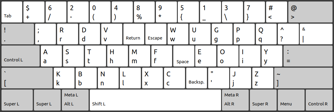
Industry

Earlier this year, I designed a keyboard layout called Industry. I wanted to try to learn an alternative layout like Dvorak or Workman, but soon after starting Dvorak, I realized it wasn’t going to work. There are a lot flaws in the layout in my opinion, such as:
- For some reason,
uis under the left index finger instead ofi. The only possible explanation I have found for this is that Dvorak favored sequences of keys to be typed from the edges of the keyboard to the center. landsare both assigned to the right pinky, which puts a lot of strain on that finger.- The digits and symbols haven’t been optimized.
- The “big keys” such as Enter and Backspace haven’t been optimized. This is probably my biggest gripe since Backspace is the 3rd most used key yet is on the corner of the keyboard.
The first two flaws are addressed by other popular alternative keyboard layouts, such as Workman. The third is addressed by Programmer Dvorak. I was not able to find a keyboard layout that addressed the fourth flaw to my liking, although it is arguably a flaw in the physical keyboard layout. Regardless, I will be using the ANSI keyboard on my laptop for the foreseeable future, so I decided to make my own layout. It is called Industry because I like the song “Industry” by King Crimson.
Anyway, Backspace, Enter, and Escape have been moved to the center of
the keyboard. Super has replaced Control, and Control has replaced Caps
Lock. I don’t plan on frequently using shortcuts that involve Alt
because that’s too complicated, so I’ve left Alt where it is. I also
only use one Control key. The only shortcut that is hard to type this
way is <ctrl-enter>, which is not very common for me which why I put
Enter there. Tab has been moved away because I usually am working in a
terminal where <ctrl-i> suffices. I’ll get to why Shift and Space have
been moved later.
Also, I had issues with Programmer Dvorak, too:
- I liked the idea of the digits being in the shifted positions, but the issue is that, unlike symbols, digits are frequently typed in succession, so a typist will have to often switch which shift key is depressed while typing a long number.
- The period and comma are paired with
<and>, and the far more common!and?are in less accessible positions. $and\are hard to reach, and I write a lot of LaTeX.- The digits are out of order to make the common ones (
0123) easier to reach, but for me, the middle and ring fingers are the ones that reach the symbols row the easiest. - Both Escape and
<ctrl-[>are hard to type, which is one of the most common actions in Vim.
Anyway, all of these issues are addressed with Industry:
- There is only one Shift key, depressed with either thumb. This makes
ctrl-shiftshortcuts easier to execute. This also allows for a replacement of the number pad like so: Depress Shift with the left thumb. Use the right thumb to press Space and Backspace. Move the other eight fingers to the symbols row to type digits. Enter and the symbols+-*/().,are easy accessible by the eight fingers in this position. !and?are in more accessible positions.$and\are in more accessible positions.- The digits
0123are now accessible with the middle and ring fingers. - Escape is easy to type.
Some other comments about Industry:
- I heavily used this keyboard analysis tool when designing Industry, especially for the letters, though I didn’t strictly follow the tool’s metrics. Much of the late design process was daily driving Industry and incrementally moving around keys I found annoying.
- I have no idea why typing classes teach you to press
cwith your middle finger on QWERTY. I strongly prefer using my index finger. Similarly withxandz. Industry was designed for this alternative fingering. - The following shortcuts are recommended:
<super-a>to switch back to QWERTY for when someone else needs to use your computer.<super-kbnl>should send<ctrl-zxcv>so that these common QWERTY shortcuts can still be used one-handed.
Failed Ideas
Note: When I say “too complex” below, I mean that the idea makes the act of typing too complicated to become muscle memory, and is thus impractical, at least for me.
- Use more than two layers to make the layout more compact so you don’t have to reach as far. Too complex.
- Arrange the digits as a keypad rather than a line. No space unless using more than two layers.
- Put
jandqon the physical big keys. Even though these letters are uncommon, having to go to a big key during the middle of a sentence interrupts typing flow too much. - Use the Compose key. Too complex.
- Use a separate layout for the number pad or for typing math. Too complex. Also, while typing math, it is very common to type letters anyway.
- Add a special key for Switch Layout. Such a key would not be usable to switch from QWERTY to Industry.
- Require the correct shift key to be pressed when capitalizing a
letter, i.e. to type
A, the right shift key must be pressed. Too annoying. Also, I ended up only having one shift key. - Have the two shift keys do different things. See previous bullet.
Was it worth it?
For pure practicality, probably not. Currently, I type as fast with Industry as I did with QWERTY at least for prose. Maybe there are some benefits, but I haven’t noticed any related to speed. Three benefits I have noticed:
- I can now type digits and symbols without looking at the keyboard.
- Uncomfortable keystrokes such as
<ctrl-t>or<shift-`>have been eliminated. - Backspace is much easier to type. This is especially helpful when first learning a new keyboard layout.
19 November 2022